Mastering color theory can elevate your aerial photography to new heights. Start by understanding the color wheel and using complementary colors for striking contrasts. Experiment with monochromatic schemes and analogous harmonies to create cohesive compositions. Balance warm and cool tones to add depth, and leverage natural light conditions for ideal results. Consider seasonal color palettes and psychological impacts of different hues. Don't forget to experiment with light and shadow techniques, and maintain consistent color grading in post-processing. By applying these principles, you'll capture stunning aerial shots that captivate viewers. The world of color in aerial photography is vast and full of potential.
Key Takeaways
- Understand color wheel relationships to create visually striking compositions with complementary or analogous color schemes.
- Utilize natural light conditions, especially during golden hour, to enhance color quality and mood in aerial shots.
- Experiment with monochromatic schemes and strategic color pops to create depth and focal points.
- Balance warm and cool tones to evoke specific moods and add dimension to your aerial photographs.
- Apply consistent color grading techniques to develop a signature style and ensure uniformity across your image portfolio.
Understand the Color Wheel
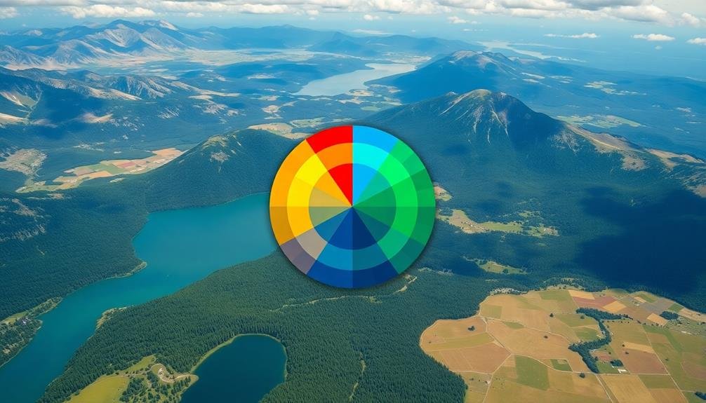
Diving into the world of aerial photography, understanding the color wheel is essential. It's a fundamental tool that'll help you create visually striking compositions from above. The color wheel consists of primary, secondary, and tertiary colors arranged in a circular format. Primary colors are red, blue, and yellow, while secondary colors (green, orange, and purple) result from mixing primaries. Tertiary colors fill the gaps between these.
You'll want to familiarize yourself with color relationships. Complementary colors, found opposite each other on the wheel, create high contrast and visual impact. Analogous colors, which sit next to each other, produce harmonious and soothing effects. Triadic color schemes use three evenly spaced hues for a balanced yet vibrant look.
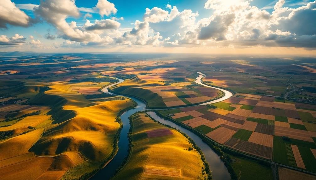
When shooting from above, you'll encounter various landscapes with distinct color palettes. Use the color wheel to identify dominant hues and plan your compositions accordingly.
For example, a golden wheat field against a blue sky utilizes complementary colors. Or, capture the gradual shift of green forest to blue ocean for an analogous scheme.
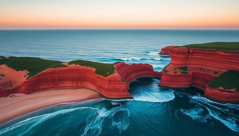
Utilize Complementary Colors
Building on your understanding of the color wheel, let's focus on one of its most powerful applications: complementary colors. These are pairs of colors opposite each other on the wheel, like blue and orange, red and green, or yellow and purple. When used together in aerial photography, they create striking visual contrast and vibrancy.
To utilize complementary colors effectively, you'll want to identify dominant hues in your landscape and seek out their opposites. For instance, if you're shooting over a vast blue ocean, look for opportunities to include orange elements like sandy beaches or autumn foliage.
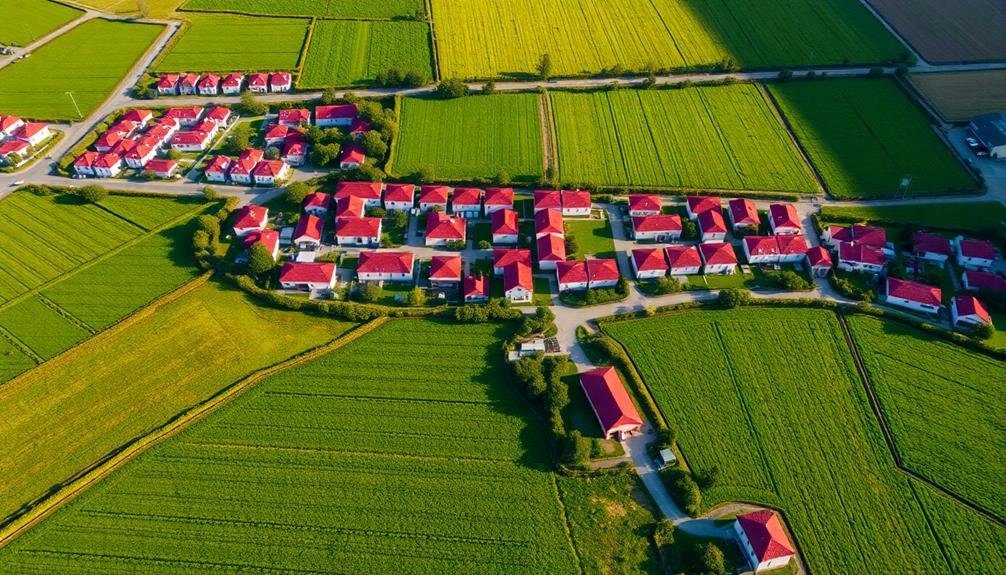
In urban settings, you might contrast the green of parks with the red of brick buildings.
Don't overdo it, though. Aim for a balance where one color dominates while the other provides accent. This creates harmony rather than chaos.
You can also play with different shades and tones within the complementary pair to add depth and interest.
Experiment With Monochromatic Schemes
While complementary colors create contrast, monochromatic schemes offer a different kind of visual impact in aerial photography. By focusing on variations of a single color, you'll create a harmonious and cohesive image that can be both striking and soothing.
Experiment with different shades, tints, and tones of one hue to add depth and interest to your aerial shots.
To effectively use monochromatic schemes in your aerial photography:
- Choose a dominant color that's prevalent in your scene.
- Look for various shades and intensities of that color within the landscape.
- Use lighting and shadows to create texture and dimension.
When shooting monochromatic scenes, pay attention to patterns and textures. These elements become more prominent when color variety is limited, adding visual interest to your composition.
You can also incorporate small pops of contrasting colors to create focal points within your monochromatic image.
Don't be afraid to push the boundaries of your chosen color. Experiment with different times of day, weather conditions, and seasons to capture unique monochromatic scenes.
You'll find that even subtle variations in light can dramatically alter the mood and impact of your aerial photographs.
Embrace Analogous Color Harmonies
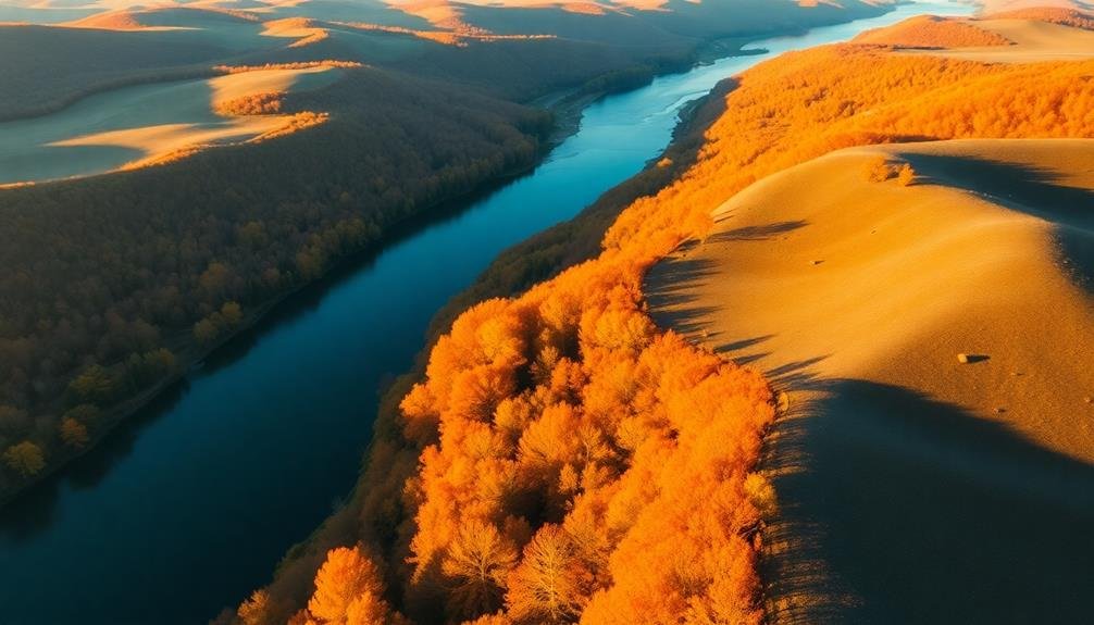
Look for adjacent colors on the color wheel to identify analogous color schemes in your aerial shots.
You'll find that these harmonious color combinations naturally create a sense of visual flow and cohesion in your images.
Identify Adjacent Color Schemes
Color harmonies can elevate your aerial photography to new heights. Adjacent color schemes, also known as analogous colors, are found next to each other on the color wheel. They create a sense of harmony and cohesion in your aerial shots, making them visually appealing and balanced.
To identify adjacent color schemes in your aerial photography, look for landscapes or scenes that feature colors naturally occurring side by side. These might include:
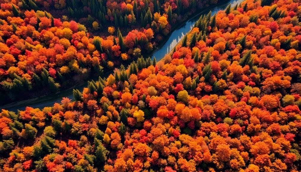
- Autumn forests with various shades of red, orange, and yellow
- Coastal scenes with blues and greens of the ocean meeting sandy shores
- Sunset skies blending oranges, yellows, and pinks
When you spot these color combinations, frame your shot to emphasize their relationship. Use the rule of thirds to position the color shifts along the grid lines or at intersecting points.
Adjust your camera settings to capture the subtle variations in hue and saturation. Consider using filters or post-processing techniques to enhance the adjacent colors without oversaturating them.
Create Visual Flow
Visual flow is the lifeblood of enchanting aerial photography. To create this mesmerizing effect, embrace analogous color harmonies in your aerial shots. These are colors that sit next to each other on the color wheel, creating a smooth and pleasing shift.
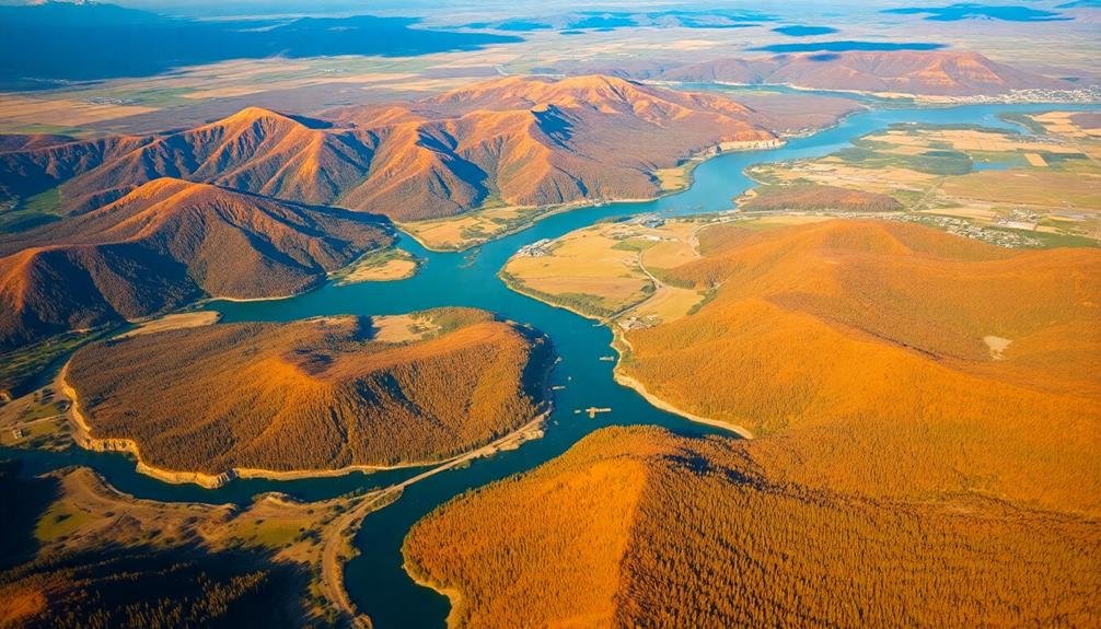
When you're framing your shot, look for landscapes or cityscapes that naturally showcase these harmonious color schemes. For instance, capture a coastline where the deep blue of the ocean gradually blends into the lighter blues and greens of shallow waters, then shifts to the sandy beige of the beach.
Or focus on autumn forests where reds, oranges, and yellows create a stunning tapestry of warmth. In urban settings, seek out neighborhoods with similarly colored rooftops or industrial areas with complementary metal tones.
As you compose your image, use these analogous colors to guide the viewer's eye through the frame. Lead them from one area of interest to another, creating a visual journey.
Balance Warm and Cool Tones
When balancing warm and cool tones in aerial photography, you'll create images with greater depth and visual interest. This technique involves juxtaposing colors from opposite sides of the color wheel to enhance contrast and evoke specific moods.
To achieve this balance, pay attention to the natural warm and cool elements in your aerial scenes, such as the golden hues of sunlight against the blue sky or cool water.
Consider these tips for effective warm and cool tone balancing:
- Use the golden hour or blue hour for natural color contrast
- Adjust white balance to emphasize either warm or cool tones
- Apply selective color adjustments in post-processing
When shooting, look for opportunities to capture landscapes with inherent warm and cool elements. For example, a beach scene with warm sand against cool ocean water creates a natural balance.
In urban environments, seek out warm-toned buildings against cool blue skies or vice versa.
Don't be afraid to experiment with your camera's white balance settings to shift the overall color temperature. This can help emphasize either warm or cool tones, allowing you to create the desired mood and atmosphere in your aerial photographs.
Leverage Natural Light Conditions
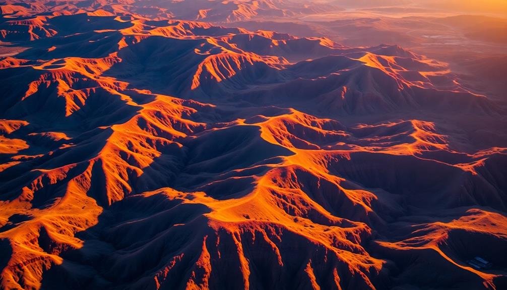
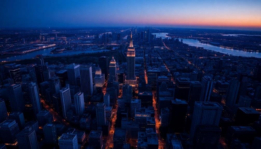
Mastering natural light conditions is essential for creating stunning aerial photographs. You'll want to pay close attention to the time of day and weather patterns to capture the most enchanting images. The golden hour, occurring just after sunrise and before sunset, offers warm, soft light that can transform landscapes. During this time, long shadows add depth and texture to your shots.
Don't shy away from overcast days; they can provide even, diffused light that's perfect for capturing details without harsh shadows. Early morning mist or fog can create ethereal scenes, adding mystery and depth to your aerial photos.
When shooting in bright sunlight, use it to your advantage by capturing sharp contrasts and vibrant colors. Consider the direction of light and how it interacts with your subject. Side-lighting can emphasize textures and create dramatic shadows, while backlighting can produce stunning silhouettes.
Experiment with different angles to find the most flattering light for your subject. Remember to adjust your camera settings accordingly, using a higher ISO in low light conditions and a faster shutter speed in bright sunlight to avoid overexposure.
Emphasize Contrast for Impact
To create striking aerial images, you'll want to emphasize contrast.
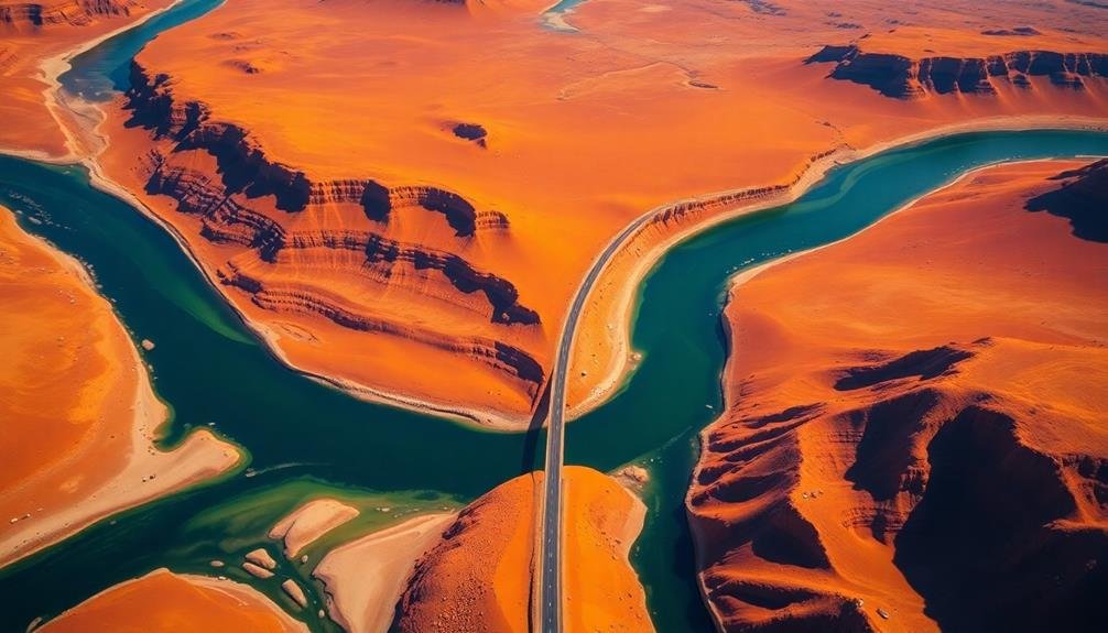
Seek out complementary color pairings in landscapes, such as blue water against orange desert sands or green forests beside red-roofed buildings.
You can also exploit the interplay of light and shadow, capturing long shadows cast by structures or natural features to add depth and drama to your shots.
Complementary Color Pairings
Color theory plays an essential role in creating visually striking aerial photographs. When it comes to complementary color pairings, you'll find that opposites truly attract. These color combinations, found on opposite sides of the color wheel, create a vibrant and eye-catching contrast that can make your aerial shots pop.
To effectively use complementary colors in your aerial photography:
- Identify the dominant color in your scene.
- Look for elements that feature its complementary color.
- Compose your shot to emphasize the interplay between these hues.
Common complementary color pairs include blue and orange, red and green, and purple and yellow. You'll often find these naturally occurring in landscapes, such as blue water against orange sand dunes or green forests against a reddish sunset sky.
When you spot these pairings, position your drone to maximize their impact.
Don't be afraid to adjust your camera settings or use post-processing techniques to enhance the contrast between complementary colors. Boosting saturation or adjusting white balance can help make these color relationships more pronounced.
Light and Shadow Play
As the sun traverses the sky, light and shadow play an essential role in aerial photography. You'll want to leverage this interplay to create stunning, high-contrast images that captivate viewers. Aim to shoot during the golden hours—just after sunrise or before sunset—when long shadows add depth and dimension to your shots.
To maximize the impact of light and shadow, consider these techniques:
- Position your drone to capture side-lighting, which emphasizes texture and form.
- Look for interesting shadow patterns cast by buildings, trees, or landscape features.
- Use backlighting to create silhouettes and dramatic rim lighting effects.
- Experiment with different altitudes to alter shadow lengths and perspectives.
| Time of Day | Light Quality | Shadow Characteristics | Emotional Impact |
|---|---|---|---|
| Dawn | Soft, warm | Long, dramatic | Serene, hopeful |
| Midday | Harsh, bright | Short, minimal | Stark, intense |
| Dusk | Golden, rich | Elongated, mysterious | Romantic, moody |
| Night | Limited, artificial | Deep, obscuring | Enigmatic, eerie |
Explore Seasonal Color Palettes
Each season offers a unique palette of colors that can transform your aerial photography. Spring brings vibrant greens and pastel blooms, while summer showcases lush landscapes and azure waters. Fall paints the world in warm oranges, reds, and golds, and winter offers stark contrasts with snow-covered terrain.
To make the most of seasonal color palettes:
- Research your location's peak color periods
- Plan flights during golden hour for enhanced hues
- Adjust your camera settings to capture true colors
You'll want to reflect on the emotional impact of different color schemes. Warm tones evoke comfort and energy, while cool colors create a sense of calm and serenity. Use this knowledge to guide your composition and post-processing choices.
Don't forget to experiment with complementary colors. For example, capture the striking contrast between autumn foliage and a clear blue sky.
In winter, look for pops of color against snowy backgrounds, like red barns or evergreen forests.
Incorporate Color Psychology Principles

Understanding the psychological impact of colors can elevate your aerial photography from visually appealing to emotionally powerful. When composing your shots, consider how different hues can evoke specific feelings in viewers.
Red, for instance, conveys energy and excitement, making it ideal for capturing vibrant cityscapes or autumn landscapes. Blue, on the other hand, promotes calmness and serenity, perfect for ocean views or peaceful countryside scenes.
Use yellow to create a sense of optimism and cheerfulness in your aerial images, particularly when photographing sunlit fields or urban parks. Green can represent growth and harmony, making it excellent for capturing lush forests or well-manicured golf courses.
Purple adds a touch of luxury and mystery, which works well for twilight shots of upscale neighborhoods or historical landmarks.
Don't forget about neutral colors like white, black, and gray. White can symbolize purity and cleanliness, while black adds sophistication and drama. Gray can create a sense of balance and calmness.
Edit for Consistent Color Grading
Consistent color grading can tie your aerial photographs together, creating a cohesive and professional look across your entire portfolio.
It's crucial to develop a signature style that reflects your artistic vision and enhances the natural beauty of your aerial shots. Start by selecting a color palette that complements the landscapes you frequently capture, whether it's the cool blues of coastal scenes or the warm hues of desert vistas.
To achieve consistent color grading:
- Use presets or create your own to apply similar adjustments across multiple images.
- Pay attention to white balance and temperature to maintain a uniform mood.
- Adjust saturation and vibrance carefully to avoid over-processing.
When editing, focus on enhancing the natural colors present in your aerial photographs rather than drastically altering them.
Subtle tweaks to highlights, shadows, and contrast can make a significant difference without compromising the authenticity of the scene.
Remember to maintain consistency in your editing approach, even when working with diverse landscapes. This will help you develop a recognizable style that sets your aerial photography apart and keeps viewers engaged with your work.
Frequently Asked Questions
What Camera Settings Are Best for Capturing Vibrant Colors in Aerial Photography?
For vibrant colors in aerial photography, you'll want to use a lower ISO, wider aperture, and faster shutter speed. Shoot in RAW format, adjust white balance, and consider using polarizing filters. Don't forget to experiment with exposure compensation.
How Do Weather Conditions Affect Color Perception in Drone Shots?
Weather conditions considerably impact color perception in your drone shots. You'll notice cloudy days mute colors, while sunny skies enhance vibrancy. Fog can create ethereal effects, and golden hour lighting adds warmth to your aerial images.
Are There Specific Drone Models That Excel at Color Reproduction?
You'll find that high-end drones like DJI's Mavic 3 and Autel's EVO II Pro excel at color reproduction. They've got advanced sensors and processing capabilities that capture vibrant, accurate colors. However, post-processing skills are still essential for best results.
What Post-Processing Software Is Recommended for Enhancing Aerial Photograph Colors?
You'll find Adobe Lightroom and Photoshop excellent for enhancing aerial photo colors. DxO PhotoLab and Capture One are great alternatives. Don't overlook free options like GIMP or Snapseed for mobile editing. Experiment to find your favorite!
How Can Photographers Overcome Color Distortion Caused by Atmospheric Haze?
You can overcome atmospheric haze by using polarizing filters, shooting in RAW format, and adjusting white balance. In post-processing, try increasing contrast, clarity, and vibrancy. Don't forget to experiment with dehaze tools in your editing software.
In Summary
You've now got the tools to elevate your aerial photography with color theory. Remember, it's not just about capturing stunning landscapes, but also about evoking emotions and telling stories through your images. Don't be afraid to experiment and push boundaries. As you apply these tips, you'll develop your unique style and create truly memorable aerial shots. Keep practicing, refining your eye, and watch as your color-rich photographs soar to new heights.
As educators and advocates for responsible drone use, we’re committed to sharing our knowledge and expertise with aspiring aerial photographers.

Leave a Reply